
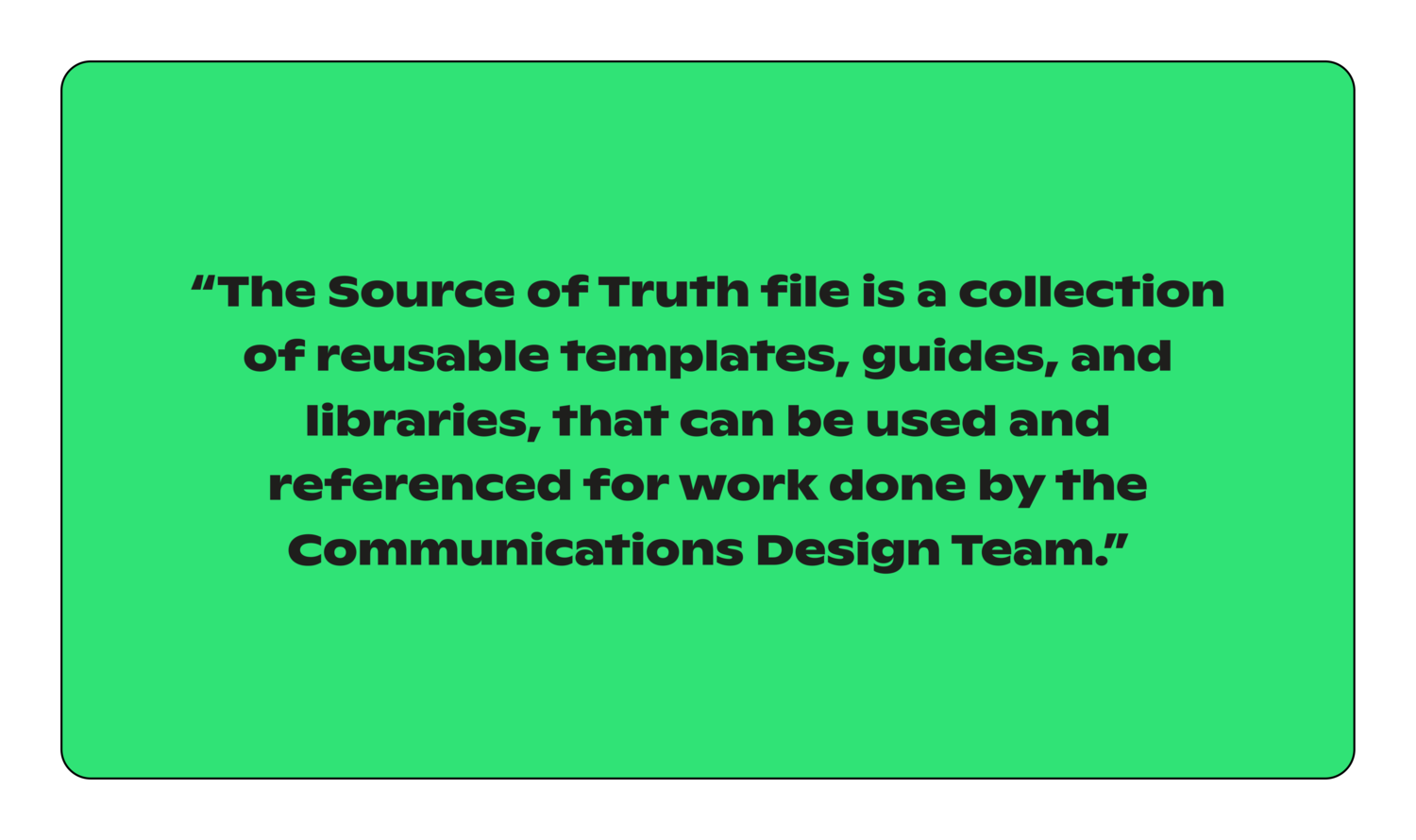
About the Source of Truth File
One of my favorite projects that I worked on while at Wish, the Source of Truth file is a comprehensive design system for the Communication Design Team.
Project goal
After working alongside product designers to create, build, and refine their design system, I was inspired to begin documenting and gathering all of the resources that my team frequently used. This process began with gathering examples of all of the illustration work we had done, which resulted in the creation of the Illustration Library. After several more libraries and process documentation files, I wanted to create a single point of truth where we could keep all of the correct information for our work.
The completion of this file improved the consistency in my team’s assets and design and decreased errors in using outdated work. It centralizes all of our libraries that we need to keep updated and organized, which has increased contribution rates and ease of use. And as Wish approaches their rebrand, this file will be instrumental in the transition of old to new asset styles, as it provides templates and tools for designers to use in labeling their files and saving assets, which will help keep everyone organized.
My role
Designer
Architect
Project Owner
Services provided
Information architecture
Visual design
Usability testing
Component based asset templates, mockups, and color system.
Tools used
Figma

Look inside the file
The Source of Truth file should be easy for contributors and designers to navigate, as it is a point of reference, a library, and a design system. Using pages to organize our team’s areas of work, each project type’s information is organized by mockups and templates. Using these templates will ensure that as we evolve the UX styling or asset sizing, designers will not have to worry about remembering the new parameters, as the component libraries will publish the current design templates. In this Source of Truth, I wanted to set my team up for success in their work, from being able to find examples of previous work in our libraries, to double checking the asset placements for iOS App Store Screens.
FAQs
An FAQ Page in the file introduces visitors to the team, as well as a link to a tutorial video walking through the file. Here you can also find a quick reference page for both our libraries as well as our guides. Including the visual of the file helps designers find familiarity within the file more quickly.

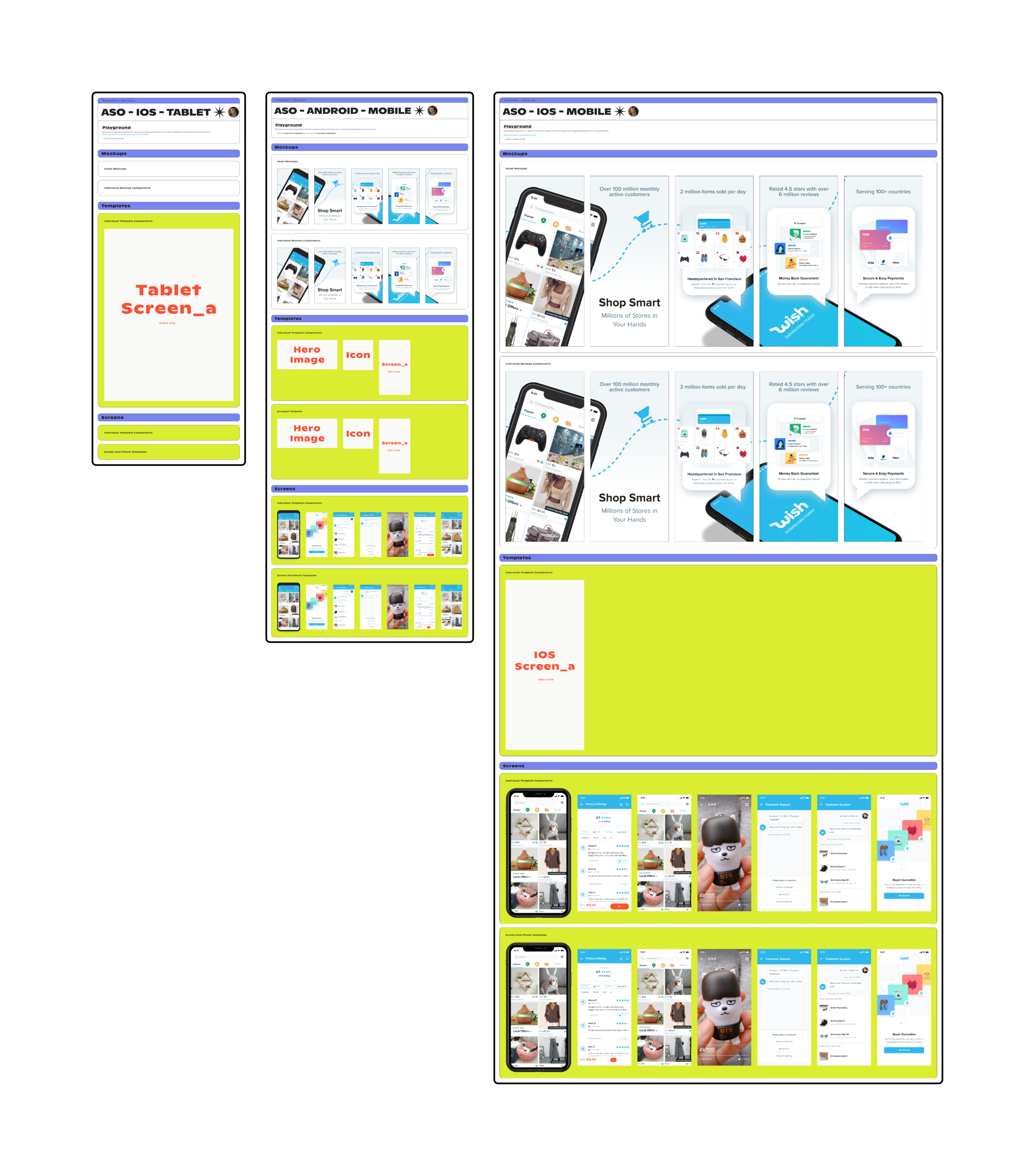
Asset templates
Using components, designers can access both individual templates as well as the complete set, all from the published library. Templates that include a mockup of current design work are also included, as a reference.
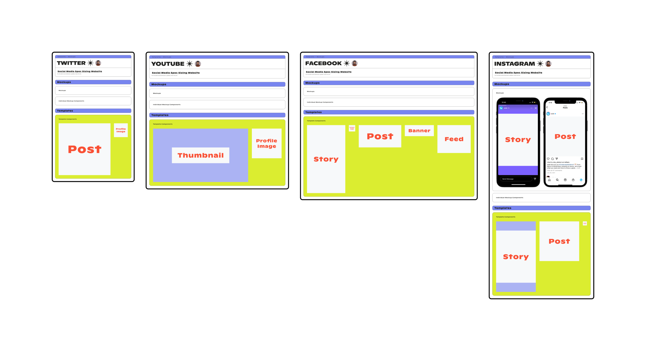
Many of the templates include components to assist the designers as they go through the design process. Some assets include naming convention and safe area notices, as well as dimensions or large placement labels, which make it easier for designers to quickly identify templates from the dropdown menu in the published library.
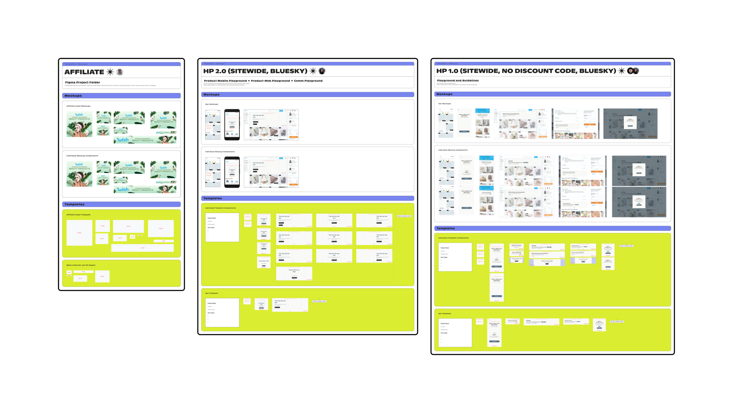
Included in the template components for homepages are a file naming frame and a “translation ready” frame, which not only remind designers of the way their work interacts with cross functional partners, but also ensures that we label our work consistently across assets so as to be as clear and organized as possible. This not only improves our work experience, but I would go as far as to say it has likely contributed to our team and the designers on it reporting some of the happiest employees scores at the company.
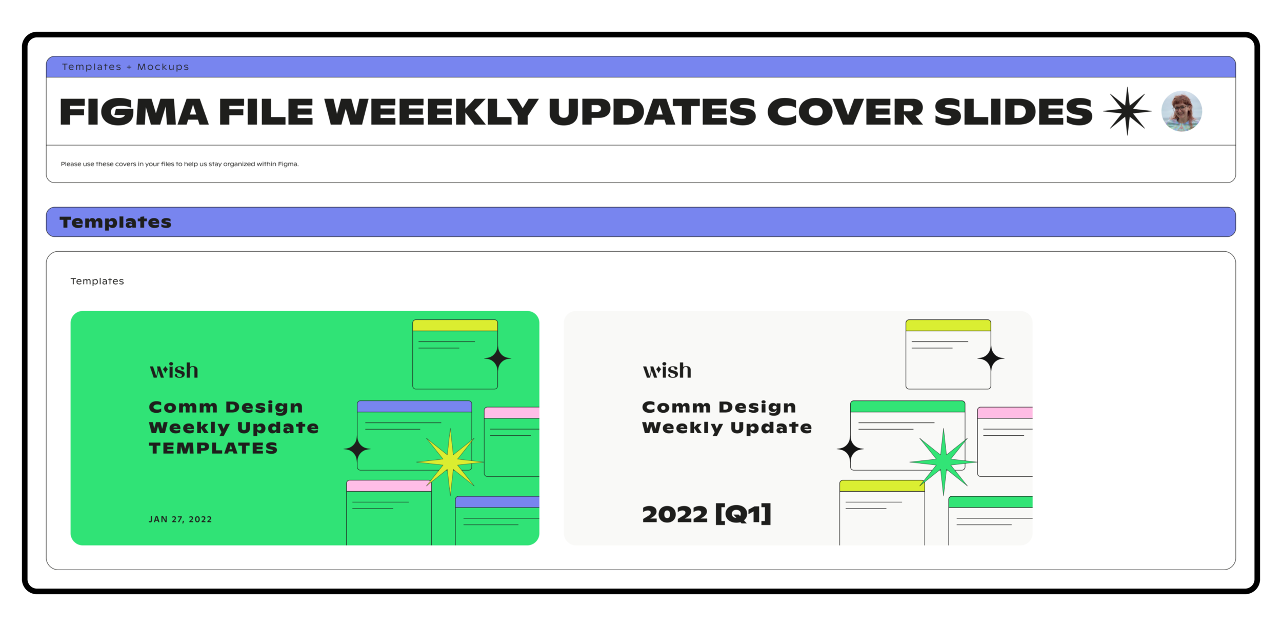
File Cover Templates
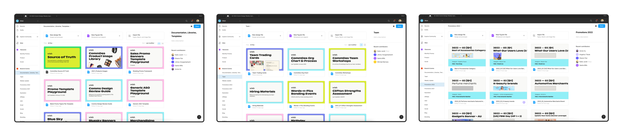
Creating a system for file covers went hand-in-hand with establishing naming conventions for our working and exported files. In Figma, designers view their projects in a visual grid, where the default file thumbnail is a preview of the working space, unless otherwise set by the designer. Using templates that boldly display the project date, name, person of contact, and designer gives all of the basic identifying information that one needs when sifting through our folders.
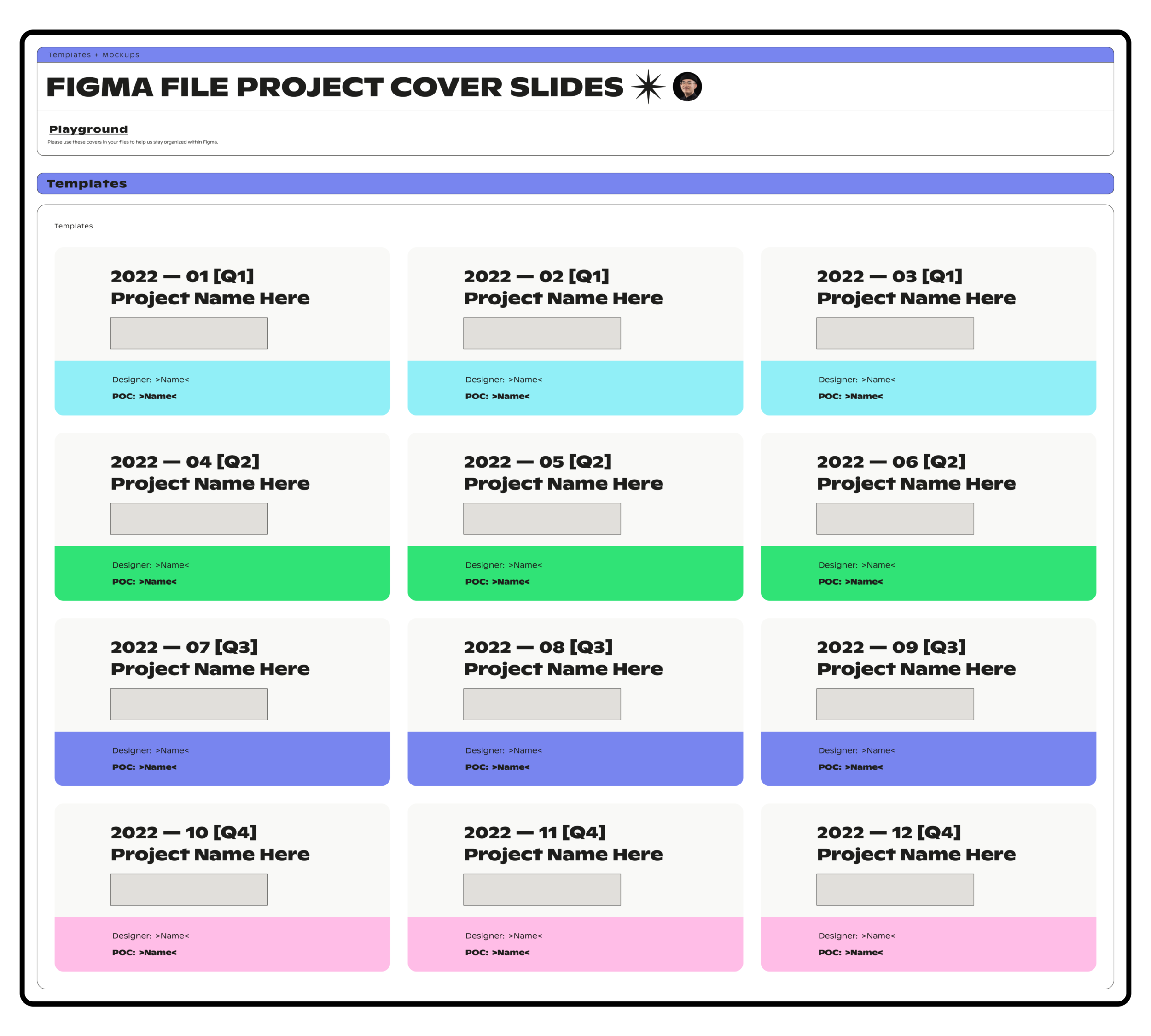
In addition, I’ve included a space for asset mockups on the file covers for project files, for ease of visual identification. These covers are also color-coded by quarter, so that when scrolling through file archives, it will be easier to perceive the time frame.
Our team uses a single Figma file to provide a Weekly Update snapshot of our work. These updates include a short description of the status and goal, as well as a screenshot of the work, with the aim to provide greater visibility across the team. These files will increase over time, as a new one is created quarterly. So the master file and each quarterly file have their own unique covers.
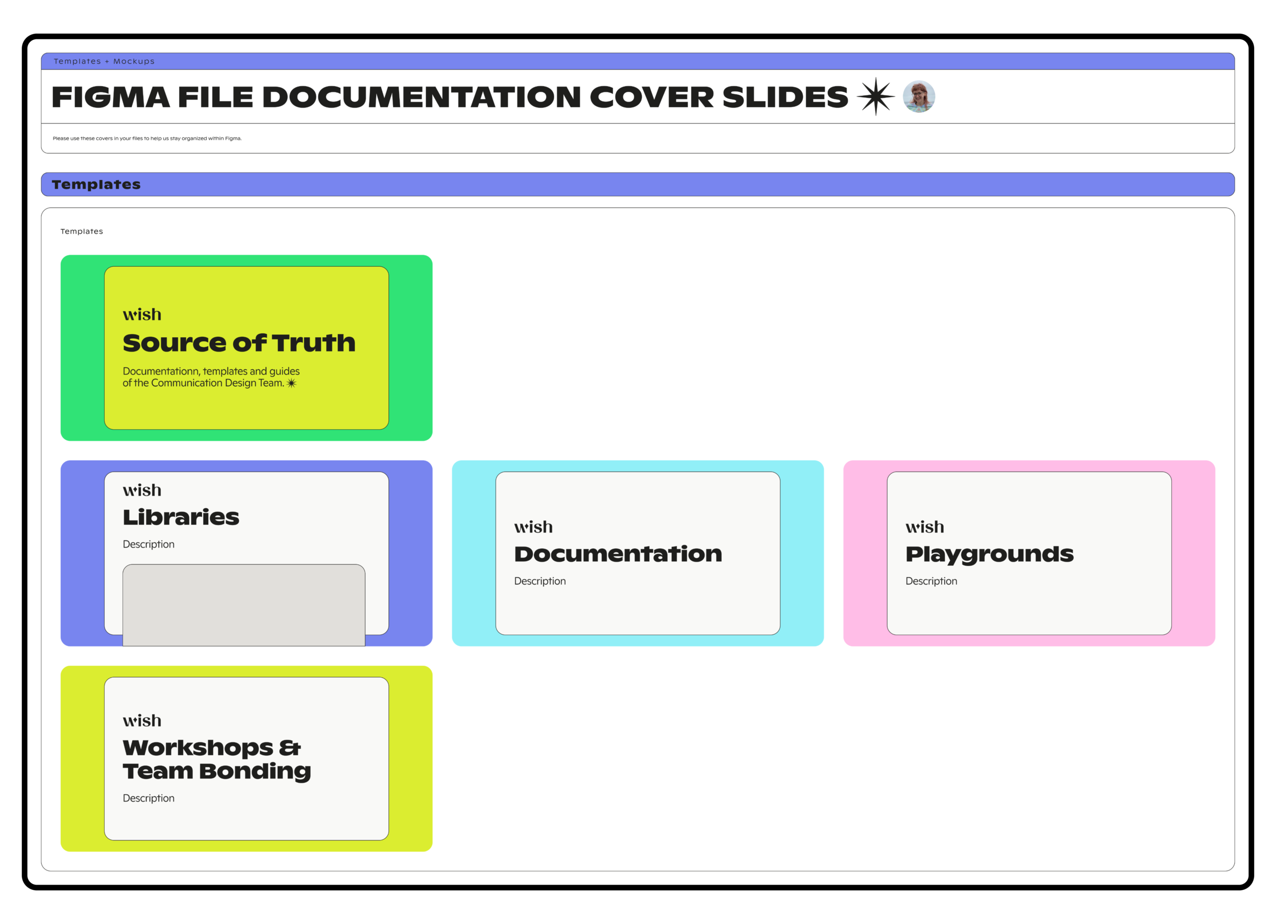
Finally, over the years we had collected a larger assortment of random, non-project oriented files within our Figma system. I created a color coded system of covers for each of these non-project file instances. Playgrounds and explorations are our brand’s lovely new pink, documentation file covers are a more clear-headed shade of blue, libraries are labeled with a calmer purple, and our brand’s energetic citrus color represents team bonding files.

Examples of the file covers and organizational system in use
While creating our Source of Truth file, I was inspired to create a folder system within our Figma account and decided to really build out and expand our team’s capacity for organization.
Many of our folders within Figma contain some sort of documentation, library, or playground file, so it is important that these files are easy for designers to locate in the visual grid. Here are some screenshots of the file covers and system in action.