
About HEO
Decentralized crowdfunding platform without boarders. Help Each Other is the first stablecoin crowd funding platform that pays out rewards to donors.
Project goal
Create Help Each Other’s website, brand identity, and pitch deck using a common interface for a familiar user experience to prepare the organization for launch.
My role
UI/UX designer
Visual designer
Presentation designer
Services provided
Information architecture
Visual design
Usability testing
UX research
Tools used
Figma for visual design
Adobe Illustrator for graphics and iconography

Look inside user interface
The design should be consistent in all screens of the site, as well as across all branded media. Using global style guides based on best practices achieve a better look and feel. In this abbreviated design system, I wanted to focus on design principles like typographic hierarchy, color palette, icon styles, layout, and repeatable interface components.

Typography
I used a maximum two typefaces, with a strong contrast between title and body.
The body font size is set around 14pt – 16pt, with the body font height around 1.3 – 1.5.
Using a typographic scale makes headlines bold, and long body copy easy to read. Language support should also be considered.

Color palette
A limited palette, with a single primary accent, allows the user generated content to stand out.
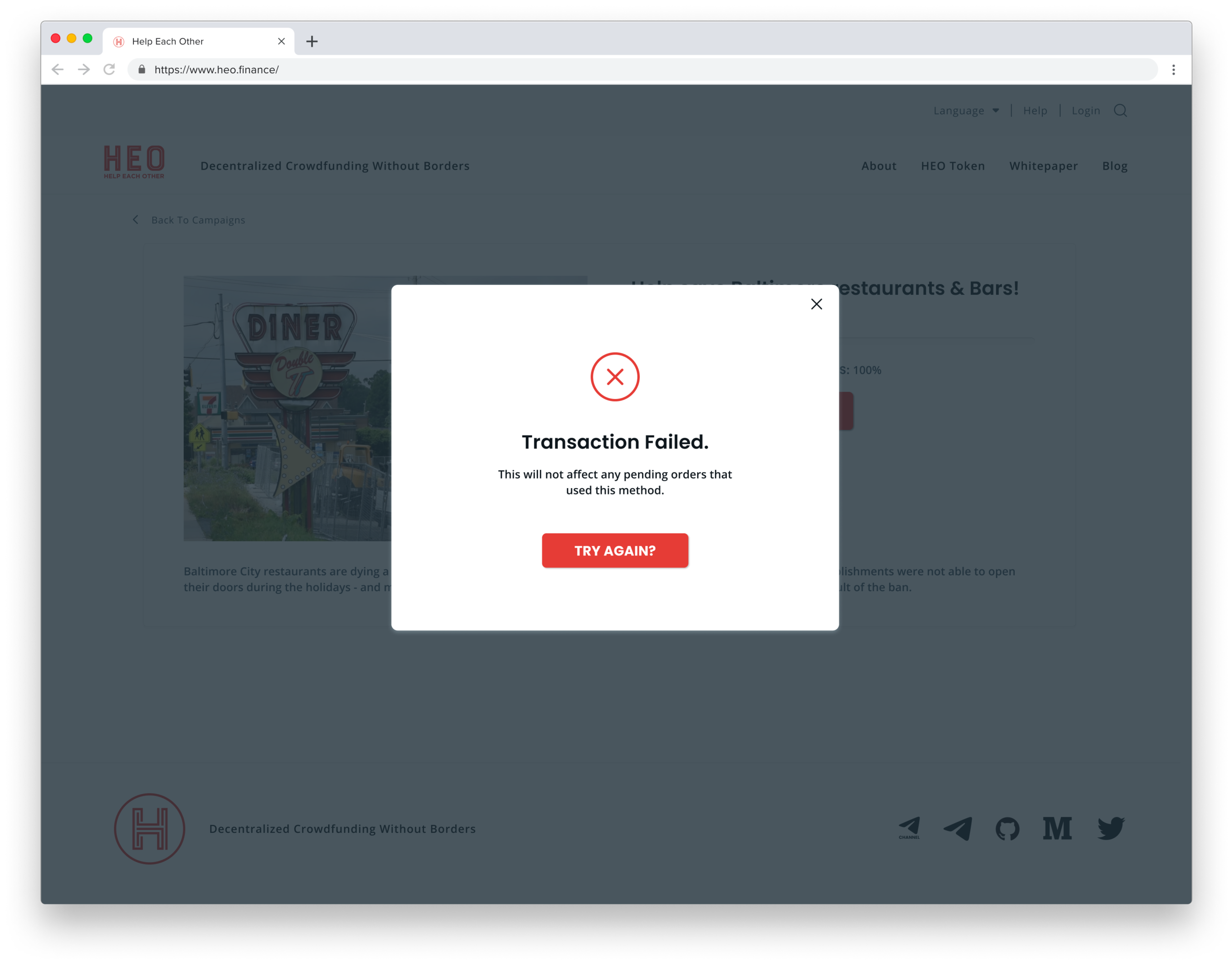
Functional colors will be used for important notifications, warning and errors. Consider accessibility, especially on text and icons.
Layout
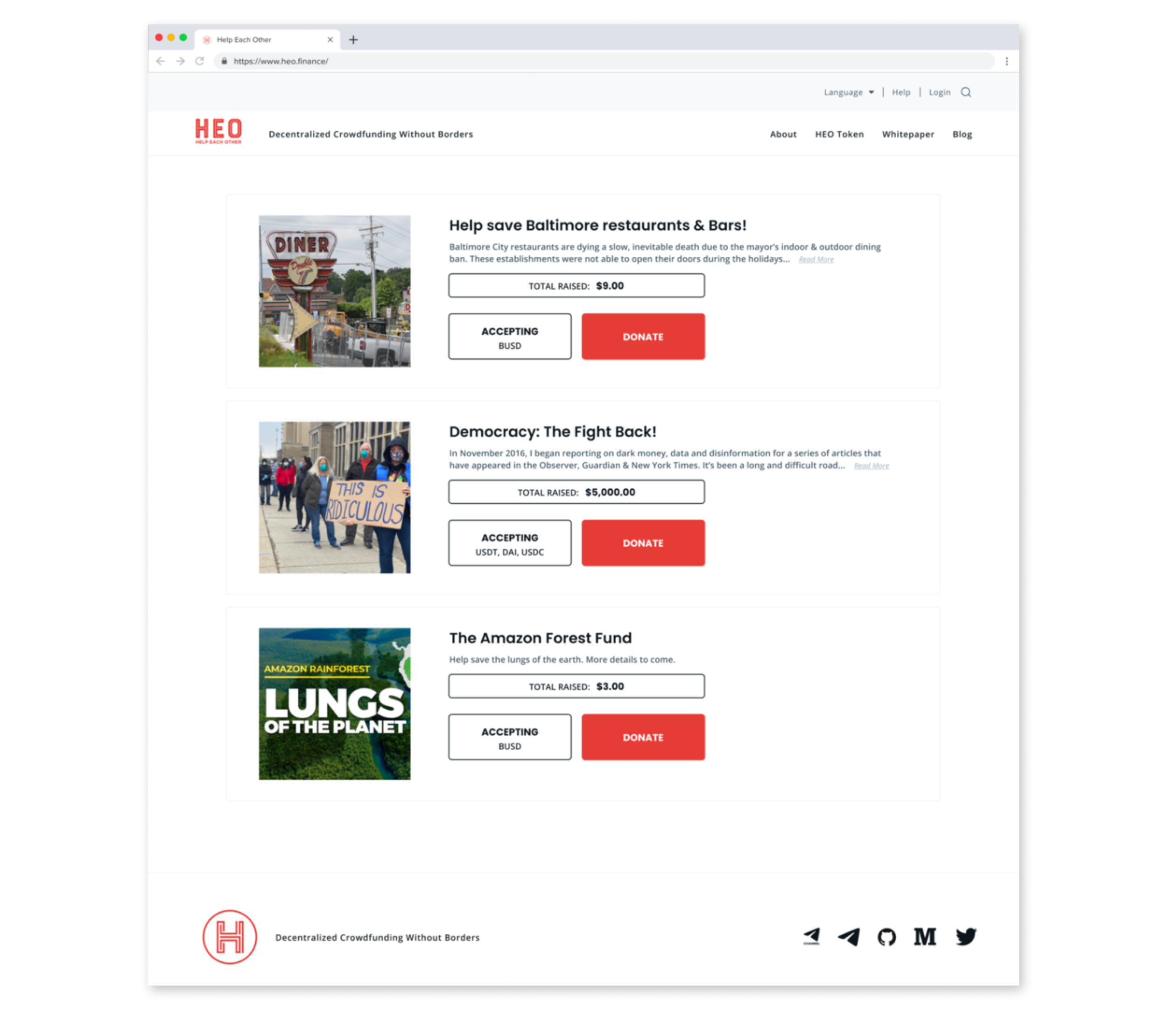
This platform uses a 4-column grid system with 2 standard layouts, organized with cards for each campaign.
Uniform spacing for larger elements and slightly tighter padding for smaller elements creates a slightly more compact and easier to navigate experience.

Iconography
All of the icons are based in a 24px grid, with four sizes supported.
Consistency – that’s the name of the game when it comes to icon design.I’ve maintained the same style, stroke width, and corner radius values in these icons.
Filled icons are supported for footer navigation links.

Logo and branding
The logo color is aligned to the color palette, and provided a logo mark as well as an expanded logo, which will allow the logo to be clean and legible at all sizes.
Visually the design pulls inspiration from passport and postage stamps, speaking to the global community that can be supported through this platform.

Deliverables
The deliverables include an initial pitch deck, and subsequent website designs. Working with one of the founder’s interns to build the site, HEO is now live and helping people across the world who are living in places where governments have shut down or blocked other crowd funding platforms.

Demo day pitch deck
Designed pages were created and passed off, then refined once the founders had added content. The goal was to polish up the existing slides to make the presentation look clean and professional.
This deck was built in Google Slides.


Web app wireframes
Aligned with the established design visuals in the pitch deck, the design showcases a polished and professional look and feel that will build trust for new users.
Clear interface that lets the imagery and content of each campaign tell their own story.